Solution
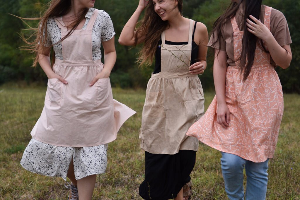
For the Nidore Living project, I created a design solution centered around a minimalistic depiction of the Anemone flower, a wildflower known for symbolizing relaxation and the importance of seizing opportunities in the present. The choice of the Anemone aligns seamlessly with the brand’s character, serving as a gentle reminder for individuals to enjoy the moment.
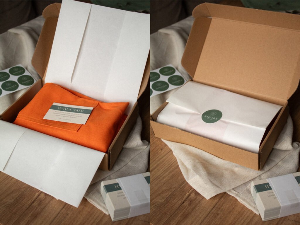
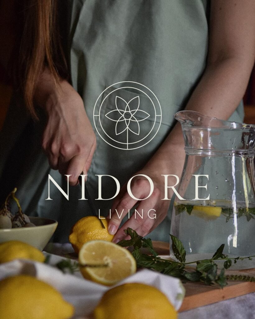
The primary color palette, with a focus on sage green, was a deliberate selection. Sage green, associated with nature, tranquility, and balance, embodies the essence of growth and harmony. Its symbolic attributes align with the brand’s commitment to sustainability and a natural way of living. The color promotes a sense of calmness, relaxation, and renewal, reflecting Nidore Living’s dedication to offering products that harmonize with both the environment and the wearer’s lifestyle. Additionally, sage green conveys freshness, sophistication, and a profound connection to the natural world, further enhancing the brand’s visual identity.